Complex Object
Close Case Study
x
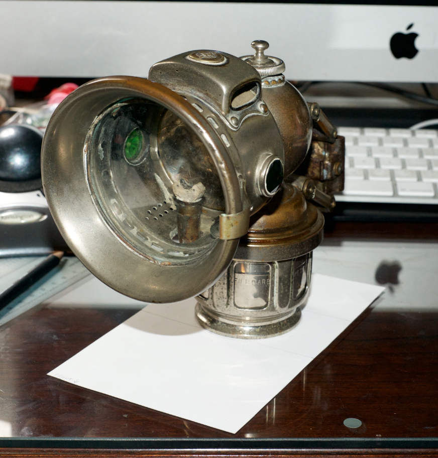
This was the ‘complicated object’ I chose. It is a Joseph Lucas King of the Road carbide bicycle lamp, No 326, made in 1915. It is steel and aluminum coated in nickle. Most of the nickle is rubbed off, which caused complications later on in the project. I love this object because it’s very old and no longer used. Most people can’t tell what it is by looking at it.
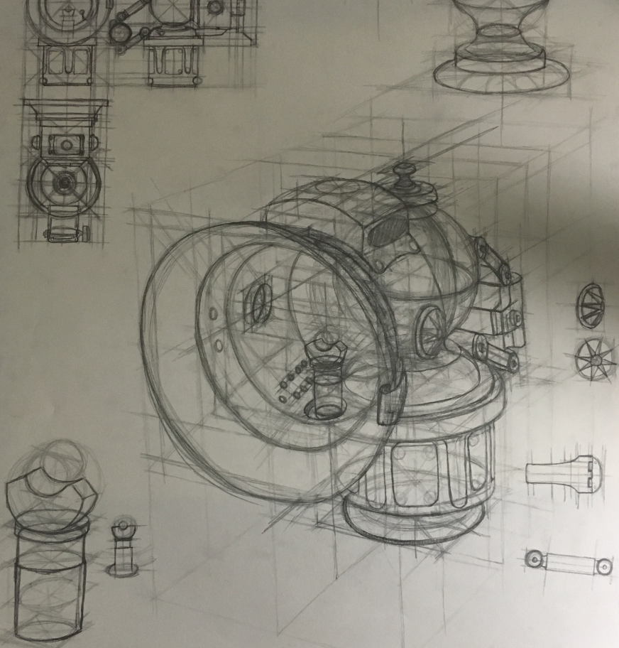
To begin, I brought my hand-drawn object to class. These were drawn in the previous semester, as an introduction to design drawing. The instructor looked at these drawings and either had us make corrections to them, or had us start on the first step in Illustrator: making the plan views.
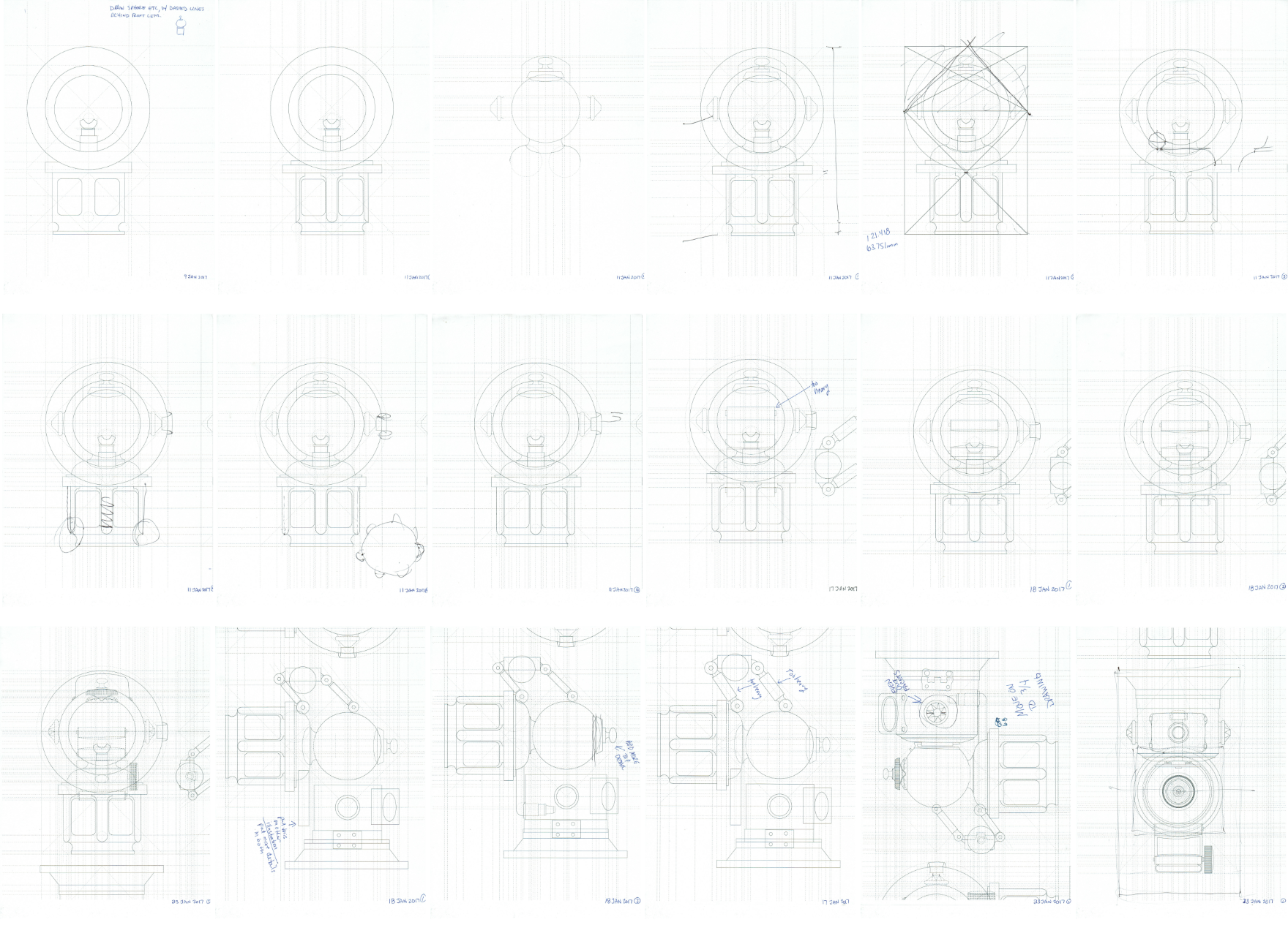
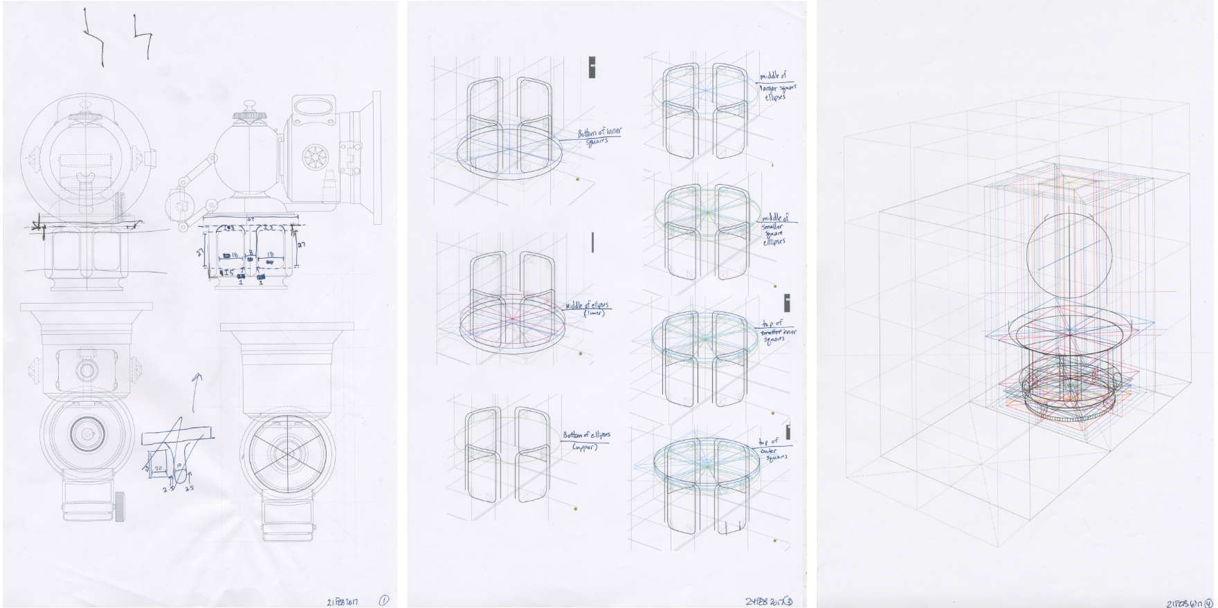
Making the plane views was probably the easiest part of this project. Unlike the pencil drawing, where I had to estimate the placement of different parts with my eye, I was able to measure with a ruler all the different heights, widths, and lengths of the parts. It was tedious, but there was no guessing involved. This part of the project was important because later on when I got to making the object in 3D, it was a necessary schematic to look back on for reference when I was having a hard time determining location and size of different aspects. It was also a good way to ramp up my observation skills; it helped me learn to pay attention to all of the tiny ridges, gnurls, curves, and spaces.

After the plane views were complete, I moved on to building the frame. This was surprisingly difficult. I just couldn’t wrap my head around the angles and the formulas. As it turns out, I was definitely looking further into it than I should have been. Once I took a break for a couple days and then went back at it, I got it figured out.
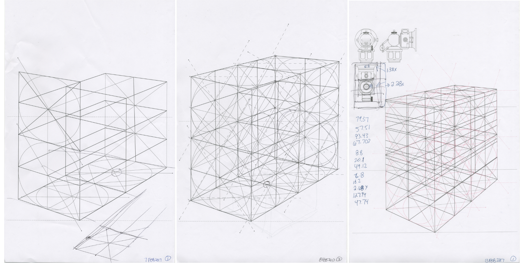
Building the frame vertically was a lot easier than making the base. It was a great moment when I got to the very last diagonal axis and it lined up with everything else I had! I knew I had a long way to go to get to the end of the project, but I was very happy I finished the second part.
And then came building the actual object. It was difficult, to say the very least. Starting from the bottom and building up layer by layer, curve by curve, and plane by plane took so long that I can’t even put it into words. I started completely over at least three times, from the very bottom, because I just wasn’t happy with how it was turning out. I have hundreds of scans of process for this project because it was so long, tedious, and time consuming. It was worth it in the end, but on the way I considered cutting corners several times. That’s not how I am, though, so I persevered.

After that many days, weeks, and months of spending so much time with my complex object, I knew it inside and out. I started anticipating what the shapes would look like, how many milimeters each tiny ridge would be, the placement of the small and large spheres, and other minute details I didn’t see before. I could even tell when something was wrong with the lines I made in the beginning of the project. I went back and tweaked my plane views weekly, as I discovered more relationships between the lamp parts I hadn’t noticed earlier.
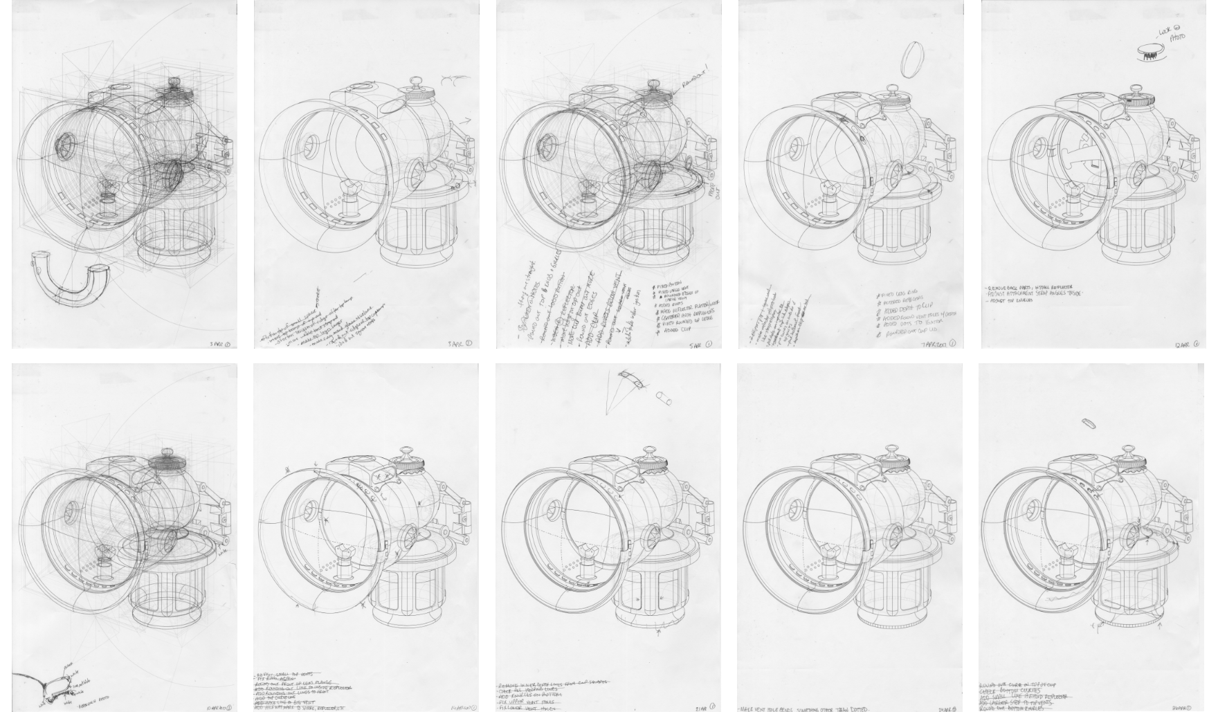
When it came time to work on the tiny gnurled details on the top and bottom sections, I didn’t have any major problems with them.
This wireframe part of the project was supposed to be completed by miderms in March, but I was no where near finished. My complex object was a bit more complicated than most of the other students in my class, so it took me quite a bit longer to finish. However, after midterms in March we all started the painting process, no matter how far along we were.
This wireframe part of the project was supposed to be completed by miderms in March, but I was no where near finished. My complex object was a bit more complicated than most of the other students in my class, so it took me quite a bit longer to finish. However, after midterms in March we all started the painting process, no matter how far along we were.
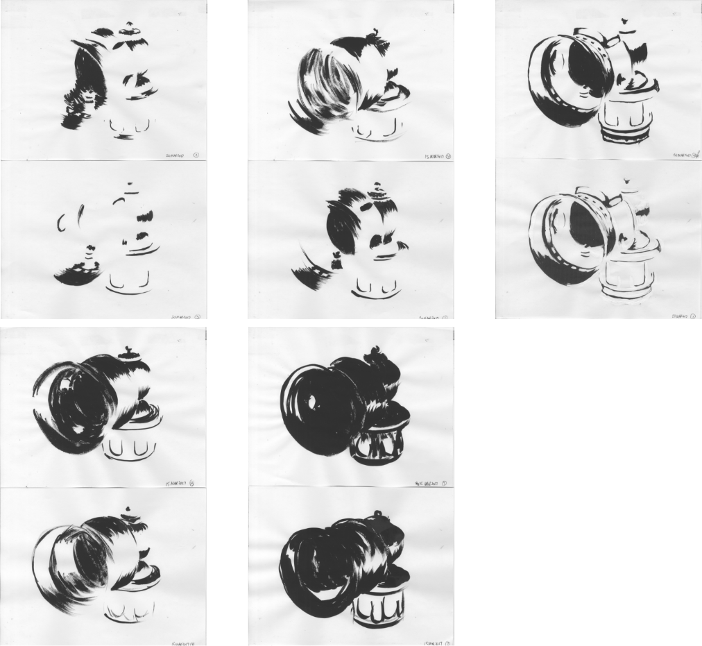
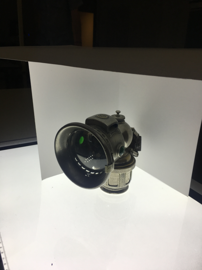
The first thing I did after midterms was to put my object onto a light table, illuminating it from below and bouncing the light off a piece of white paper from above. I painted ten gestural versions of it with Plaka paint. My versions ranged from barely any paint, up to almost a blob of black. They were quick paintings; I only took about a minute for each one.
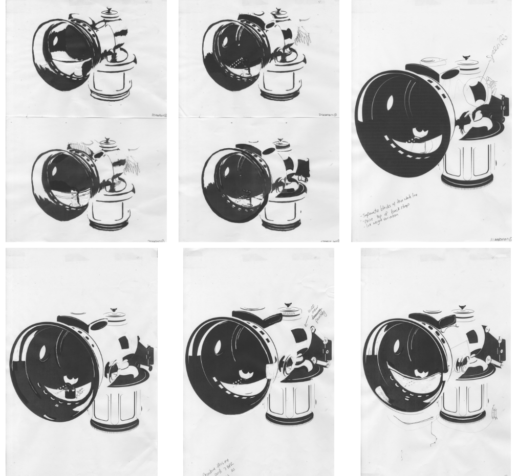
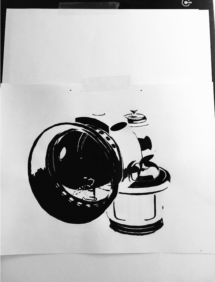
After I finished the gestural versions, I picked the painting about in the middle of darkness and light, and put it on top of a print-out of my wireframe, which was on top of another light table, so I could see the outline through the page. I then added black and white plaka, making the shadows and highlights more refined. After a couple layers of paint, I made a scan of the painting, imported it into Adobe Illustrator, and made a digital version. That version was printed out, placed on my light table on top of the wire frame print, and further refined until my instructor and I were happy with the results.

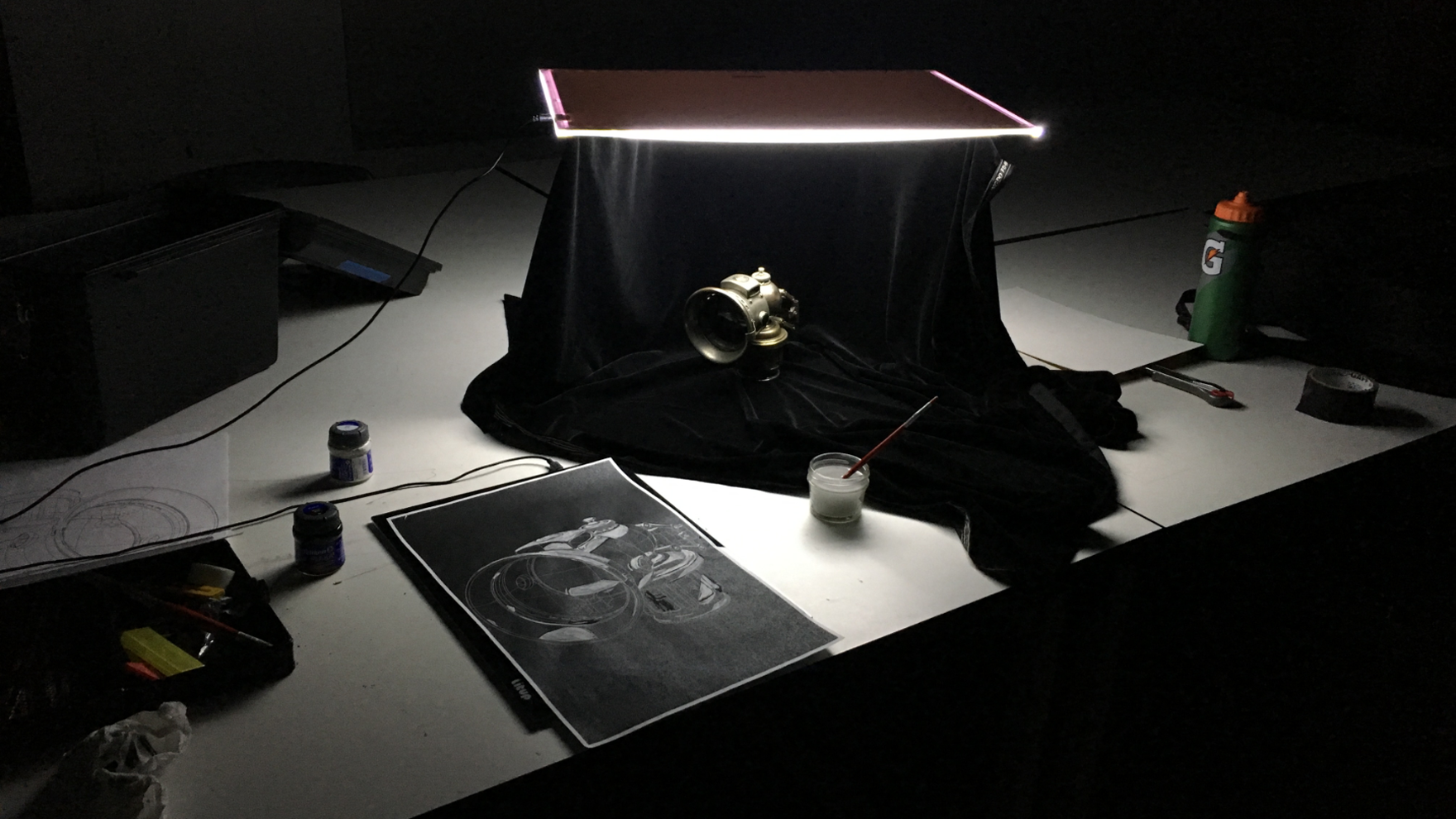
Because I finished the painting on white paper before finals, I was given the option to do a painting on black paper. I set up my object on a black, light-absorbing cloth, and placed the light table above, to make this painting very different from the previous one. I only had two days to compete this process, starting from the beginning of it, but since I had become so intimately familiar with my lamp, I was able to finish it before finals. I enjoyed painting on the black paper. White plaka paint is clumpy and difficult to get to a good consistency, but I managed to figure out a good water-to-paint ratio earlier in the semester, so it wasn’t so bad.
